
Similar to the rest of the world of technology, Google is constantly updating its platform and the way they index search engine-optimized sites. It seems almost impossible to keep up with the changes that large platforms (like Google and Facebook) continue to make. One of the largest ways that Google is changing, is by boosting the SEO on sites that are mobile-friendly. The reason that mobile sites are becoming more important is due to the ratio of sites accessed with phones and tablets, instead of desktop computers. In 2017, over 63% of sites are accessed, by mobile devices. It is believed, that by the end of the year that number would reach over 67%. Therefore, Google sees that mobile responsive sites are the most relevant for users.
What does that mean for your non-mobile-friendly site? Additionally, Will that change anything for your responsive site?
What Is Mobile-First Indexing?
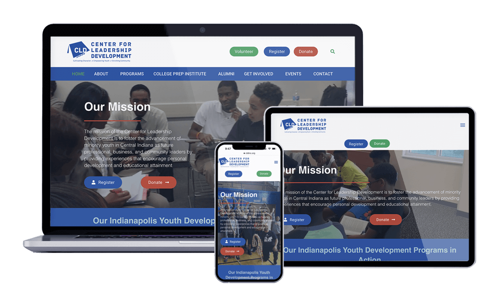 It is important to know the details of what mobile-first indexing is. Mobile responsive sites are soon to be known as the primary version of your site. Therefore, this means, to Google, your mobile-optimized website should show up higher on a Google search. Their reason for this is that more users will search your term on mobile devices rather than with their desktop computers. This does not mean that your non-mobile-friendly search will fall off of searches. This just means that you may see a negative impact, while a responsive site may get a larger boost.
How Can I Ensure I Receive Mobile-First Indexing?
As of the first of the year, Google began its testing phases. What we have seen in late summer is that many sites have begun to experience changes in their rankings due to responsiveness. If your current site is not set up to be mobile-friendly, you may want to look into updating your site to ensure the best rankings possible.
There are a few ways to gain a mobile-friendly website.
- The easiest way so to update your website and be sure that it includes a mobile responsive view.
- Another way to get a mobile-friendly website is to add responsiveness to your current site. This can end up being difficult with the design of your current site. Most of the time, this method can be more expensive and more time-consuming. It is like adding a second story to your house. There are hiccups and structural issues that you will run into.
- Last but not least, you can create a subdomain for your desktop site. For the subdomain, you will be coding your site to fit on smaller screens. Again, this way will be more expensive and more time-consuming.
Even with a mobile-friendly site, you will need to be sure that your site is loading quickly. Google wants to ensure that visitors to your site have the best user experience possible.
How Can Nextfly Help?
Our team at Nextfly Web Design knows how important it is to have a website that can be viewed easily on mobile phones and tablets. We offer responsiveness on our custom and templated websites. It is important for us to find a solution for your budget, therefore, our team will do what we can to be sure to keep your best interests in mind.
Are you in need of a mobile responsive website? Contact a representative to see how we can assist you to get the best ranking possible!