Mobile Web Design That Engages Your On-the-Go Audience.
Mobile Web Design
Mobile devices like smartphones and tablets have become so prevalent that they now account for the majority of website traffic worldwide. As a result, you must account for mobile users when designing your website. Without Mobile Web Design, you risk frustrating many visitors you’re hoping to connect with by presenting them with a website that doesn’t work well on their devices.
Advantages of Mobile Web Design
Increased Visibility and Traffic
Search engines prioritize mobile-friendly websites in the search results of mobile device users. Equipping your website with mobile-friendly features will give your business a much better chance of being noticed by prospective customers.
Improved Visitor Engagement
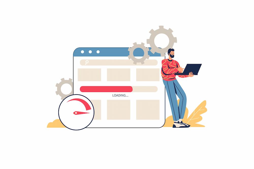
When visitors come to your website, they decide within .2 seconds on average if they will stay or leave. If your website is hard to navigate, confusing, and doesn’t look right on their screen, they’re going to leave without even looking at your content. A mobile-friendly site with easy navigation will keep mobile visitors engaged longer, which increases the likelihood of them becoming customers.
Easier conversions
Naturally, you want to make it as easy as possible for website visitors to do what you want. With mobile web design, your calls to action can fit the experience of your mobile users. For example, do you want them to fill out a sign-up form for your email newsletter? A mobile-friendly site can get the form to fit in the screen and make the “submit” button easy to press with a thumb. It’s hard enough to get a conversion, and not having a mobile-friendly website just makes your job harder.
Review The Mobile-Friendliness of Your Website
Grab your smartphone and visit your website. Ask yourself the following questions:
Does it load in three seconds or less? Are you able to easily read the content? Are your eyes attracted to the key selling points? Can you recognize the call to action? Are you able to act? Would you spend time on the site if it was not your own?
If your website isn’t optimized for mobile, we can help!
Receive Expertise From An Experienced Mobile Web Design Team
The NEXTFLY team has a proven track record of improving conversion and engagement rates for clients who optimize their sites for mobile.
