
 May is always one of my favorite months, it generally signifies the beginning of summer. The weather is warming up, the kids are winding down the school year and people are preparing for that big summer vacation coming up. This year May will be a little different. This year May brings hope of our country opening back up and things getting to some kind of normal, whatever that new normal may be. If May first is the day that we begin to reopen some businesses, it will be good for our economy and for people who have been out of work. I do feel, however, that people are still going to be hesitant to just go out shopping with no real purpose. People will be eager to get out but still cautious and worried about a new spike in the virus. People are still going to be doing the majority of their “window shopping” and research on the internet before heading out to make that final purchase, which may or may not happen online. Making sure that your site is still amped up for extra online traffic is still a must. Now would be a good time to give your site a facelift as well. A sign to your company that you are still around and ready for business. Here are some trends in web design for 2020 that you can use to give your site a little change.
White Space
White space has been fairly consistent for many years as a classic design element and 2020 is no different. White space is easy on the eyes. When looking at a webpage white space helps the eyes to easily differentiate things that go together. If there is little white space between two items the eyes and brain will associate those as one, and the same goes for large amounts of white space between two items, the brain will automatically separate them. If you are not a fan of too much white space then you may go with white frames around items, this is very trendy right now and can really make some of your featured content or images really pop off of the page.
Dark Mode
Another fairly popular trend is going for the exact opposite of white and going with all black. This design element is another way to really make things pop off of the page. Any bright elements of color and imagery really stand out in dark mode.
Color Palletes
 Soft muted color palettes are all the rage right now, so even if you were unable to give your site an overhaul you could switch up some color choices and give your site a new look. Make sure it still goes with your logo and your overall branding choices.
If you do want to switch up your colors, consider using softer colors for information and backgrounds and then use your bolder colors for any calls to action you may have and other small things that need that extra pop.
Fonts
For several years now web design has moved away from the standard 12px font size. If you are still using smaller fonts you should consider changing to those to a bigger size. 18px is more the standard for general information these days. 12px is difficult to read especially on smaller laptop and tablet devices and especially on phones. Don’t be afraid to go as big as 30-50px for your headings. Try to keep your headings in a size tier system though. If your main header is font 38, then every heading below it should not be a bigger size. It is estimated that people read about less than 30% of what you have written on your site. Make sure that you are using great headings and choosing wisely what you write. You need to grab your audience’s attention and make them want to read more than 30%.
When choosing a font, the go-to right now is simple and clean. Use images and design elements to get your flair of fun. When it comes to text less is more. Sans Script is always a good clean choice.
Fun
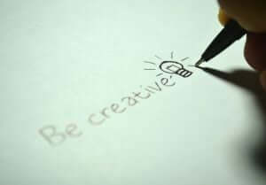 Being playful and fun is very “in” right now with web design. Combining design elements together is very trendy. Hand-drawn icons are very 2020, and they give your site a touch of your personality as well as that fun aspect.
A playful cursor is also a nice touch that is becoming more and more common these days. Maybe your car parts accessory store has a speedometer as the cursor or a mixing spoon for your recipe site. There are many ways to add that touch of personality to your site in subtle, not overwhelming ways.
Header
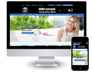 Full page headers are still the go-to in design. It is the first thing that your visitors see and making sure that it is a dynamic image that catches your audiences’ interest. It needs to have no clutter and only pertinent information to get the reader to continue on to the rest of your homepage and hopefully into your site. Studies show that people’s interest is generally focused on the top left, so make sure that you are getting the most bang for your buck in this section of your header.
Choose Nextfly
There are a lot of options as far as design choices and making your site your own. As long as you stick to clean and clear verbiage and a lack of overall clutter on your site the rest is mostly personal taste. If you would like some help redesigning your current site or maybe even getting a brand-new site up and running, we would love to help. Contact us today and we can help get your dream design out on the web.