Every day, more and more Americans are using their mobile phones and tablets to surf the web, make purchases and learn about Phoenix companies nearby. Currently, mobile devices make up a quarter of all web traffic and that rate is increasing everyday. If you take a look at your website traffic, how many of your visitors are coming from a mobile device? More importantly, how many visitors are you losing immediately because your website isn’t optimized for for mobile design?
It might be time to make a switch to Phoenix Mobile Design.
 Increased traffic- Not only will your viewers like your mobile-site, since it will be a user friendly design, but Google does as well. By having a Phoenix site that has a mobile design, your website is more likely to show up in Google’s search results by a user performing a search via a mobile device. These days consumers don’t wait until they’re at home with their desktop to perform a search, they immediately search on their mobile devices while they’re shopping, eating, watching TV, and even in bed. Google understands the importance of this and rewards company’s with a Responsive Web Design, and will in turn rank them higher in search results done on a mobile device.
Reduce bounce rates– When website users come to your site on their mobile devices, they decide immediately if they’re going to stay – or go check out your competition. If your website design is difficult for users to find what they are looking for immediately, (which most desktop sites don’t), they’re going to leave without even looking at your content. Having a mobile optimized site that is easy for your viewers to navigate, will keep them around longer, which could result in a new client or customer for your Phoenix business.
Increase conversions – A website that’s responsive makes it easy for your Phoenix customer to do what you want them to. Want them to sign up for your newsletter? It probably would help if the form fit in their phone or tablet screen and the “send” button was easy to press with the tip of their thumb. At NEXTFLY, we know that It’s hard enough to just to get a website conversion, and not having a mobile-friendly website is just making your job even more difficult.
No matter if you already have a website or are starting all over with a brand new website design, we can help! Our Phoenix developers understand the needs of mobile users and develop user-friendly Phoenix Mobile Design sites that look like they could be stand-alone sites themselves.
If your current mobile site isn’t up to speed, or your website isn’t optimized for mobile, our Phoenix Mobile Design Company can help.
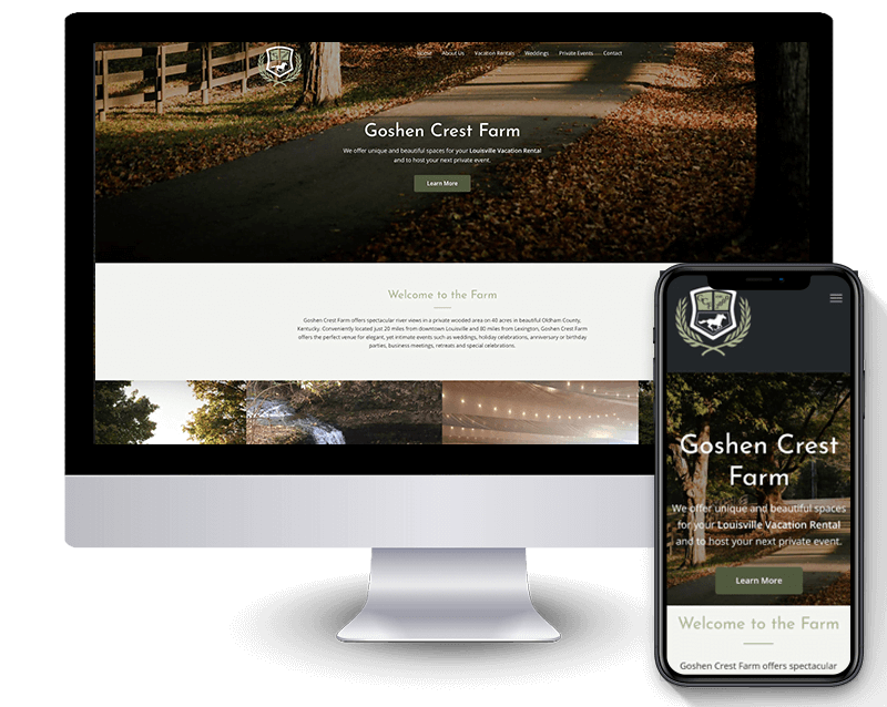
Take a look through our portfolio to see examples of mobile sites we’ve done for our clients. Interested in learning more? Give us a call, fill out a contact form, or get in touch with us by using the “chat” feature we have enabled on our website. We welcome all Phoenix businesses, large or small. We look forward to working on your Phoenix Mobile Design soon!